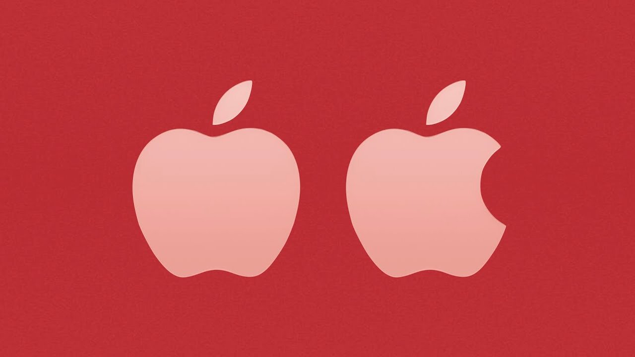
Why There's A Bite In The Apple Logo
Apple is one of the most iconic brands in the world, with an instantly recognizable logo, that’s included on almost every product they make. But one thing people have always wondered is why there’s a bite in the logo, and that’s what I’ll explain right now.
So back in 1977 Steve Jobs turned to an ad agency to design a simple logo that could be printed on their computers. Since the original hand-drawn logo of Issac Newton under an apple tree was a little to complicated. Rob Janoff was assigned to the project, and Jobs gave him just one request. Saying, “don’t make it cute.” With that in mind, Janoff began working on the logo. He decided to focus on the imagery of an Apple instead of the typography, which was a different approach than other computer companies like IBM and Hewlett Packard. Whose logos were primarily text based.
Janoff started with a simple silhouette of an apple with a leaf on top. But this imagery was pretty ambiguous, since there are several fruits that have a round shape with leaves stemming off. Janoff pointed out that several people mistook the apple logo for a cherry, since there was no clear context for how large or small the fruit might be. So to solve these problems, Janoff added a bite. Which allowed people to immediately identify the logo as an apple, while still retaining a simplistic design. Finally, six colorful stripes were added to symbolize the Apple computer’s ability to display color images, something no other machine could do at the time.
When Janoff presented the logo, Jobs simply said, "Okay, that's nice.” And made it the official logo of the company.
But there’s a myth that persists to this day that the bite taken out of Apple’s logo was a play on words. Since the term byte, spelt b-y-t-e, is used in the tech industry as a unit of memory size. Although Janoff himself admitted the rumor wasn’t true. Saying, “I’m afraid it didn’t have a thing to do with it. It’s just a small happy coincidence.”

